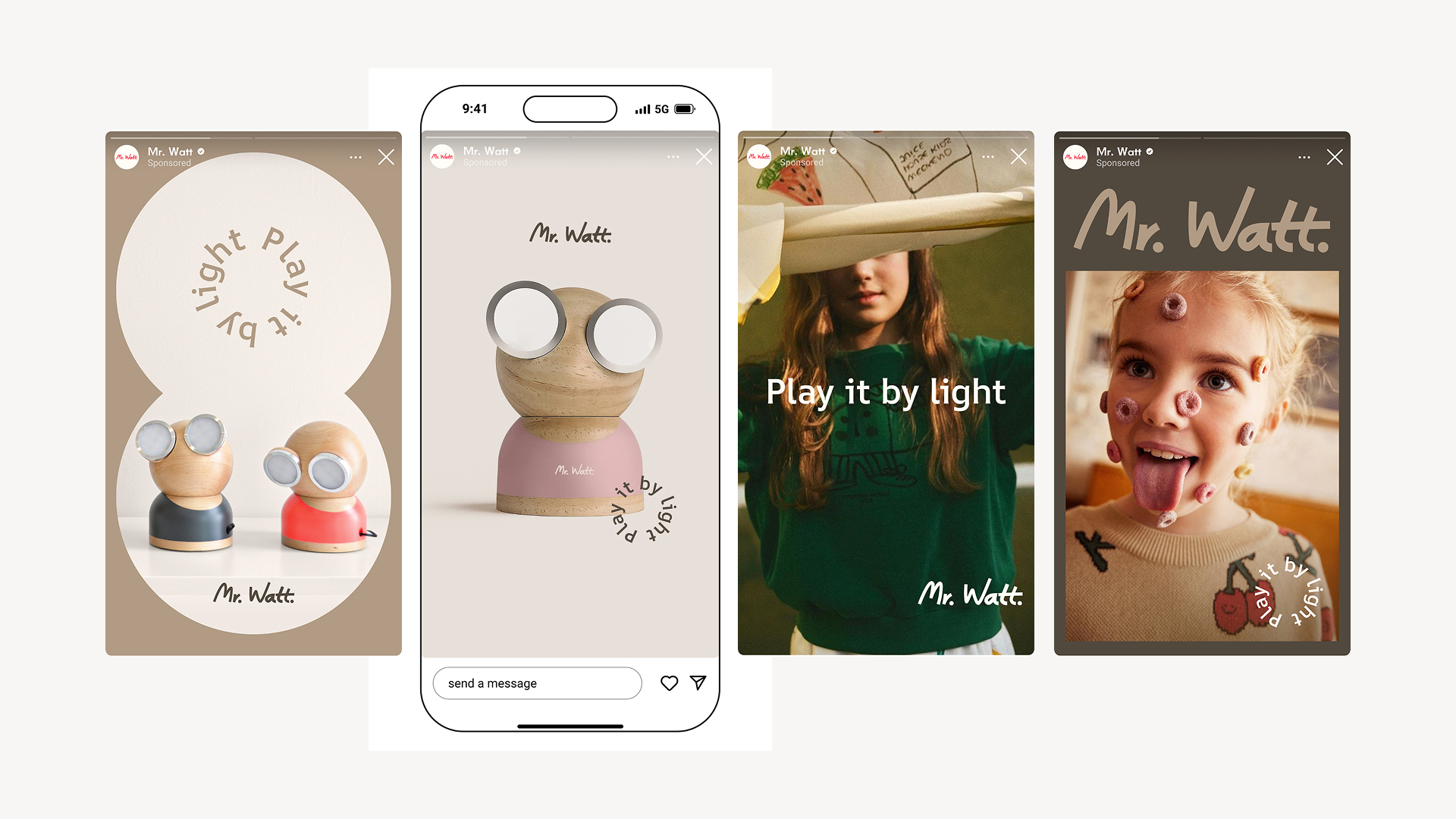
Brand Guidelines
This guide defines the visual language, design principles, and creative foundations that shape every expression of the Mr Watt brand.
At its core, Mr Watt is about design, warmth, and imagination — capturing the balance between functional lighting and emotional experience. These guidelines translate that essence into a consistent visual system, covering color, typography, imagery, motion, and digital presence.
Whether you’re designing packaging, product visuals, or communication materials, this guide ensures that every touchpoint reflects the clarity, playfulness, and modern aesthetic that define the Mr Watt identity.
Contents
01
The vision
02
The brand idea
03
The brand character
04
Logo
05
Graphic elements
06
Color
07
Typography
08
Brand in use
01
The Vision
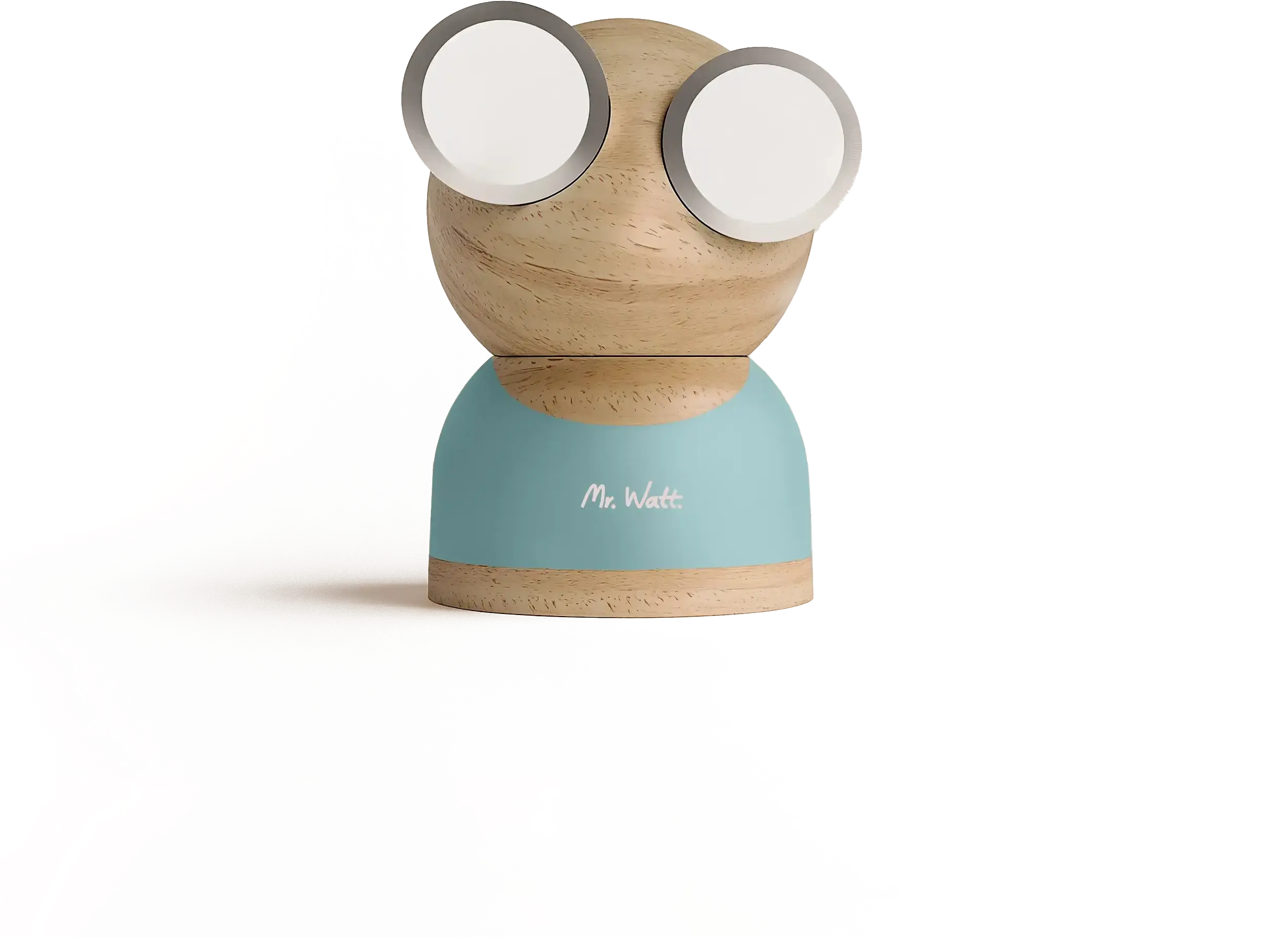
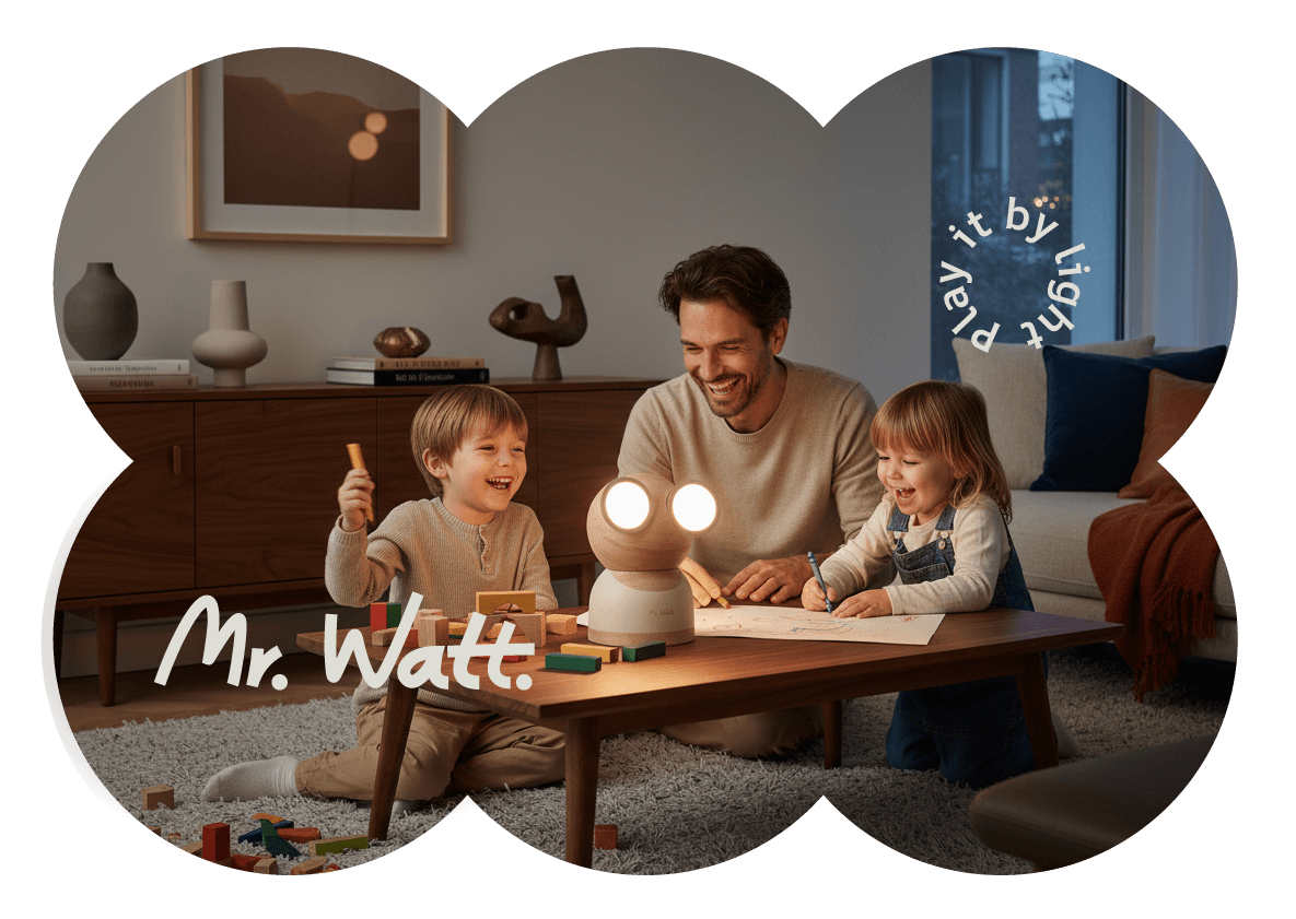
Mr Watt was created to bring warmth, character, and imagination back into the home.
In a world where objects are easily replaced, Mr Watt invites people to reconnect with the things around them — not through complexity, but through a simple, expressive presence.
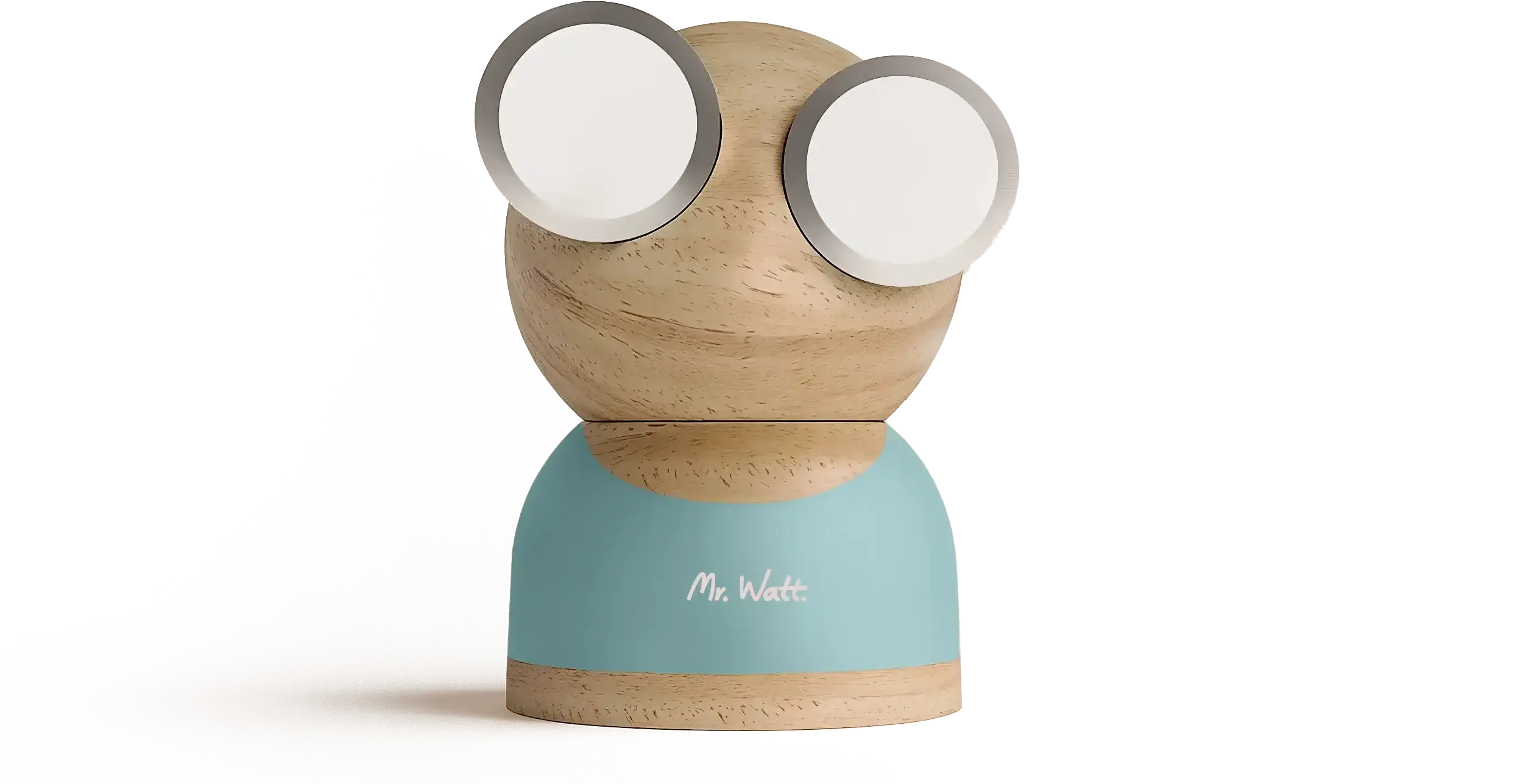
More than a lamp, Mr Watt is a companion to everyday life.
It adapts to moments, moods, and spaces — always balancing functional light with emotional depth.
Our vision:
Light that feels alive.
Light that plays along.
02
Brand Character
Play it by light.
Mr Watt blends thoughtful design with a sense of play.
It brings together the precision of modern craftsmanship and the joy of everyday creativity.
Not too serious.
Not too childish.
Just the right mix of character and calm.
Mr Watt turns any home into a place with personality — one that reflects the people who live in it.

03
Brand Character
Personality
Warm. Curious. Sophisticated without showing off.
A character that feels alive in your home — calm at times, playful at others.
Tone of voice
Simple, light, and human.
We avoid jargon, exaggeration, and empty claims.
We speak with the same confidence and ease as our design looks.
Values
- Design with emotion — every line and light has meaning.
- Connection over consumption — less, but better.
- Play as a mindset — creativity belongs in every home.
- Sustainability through longevity — objects that age beautifully.

04
Logo
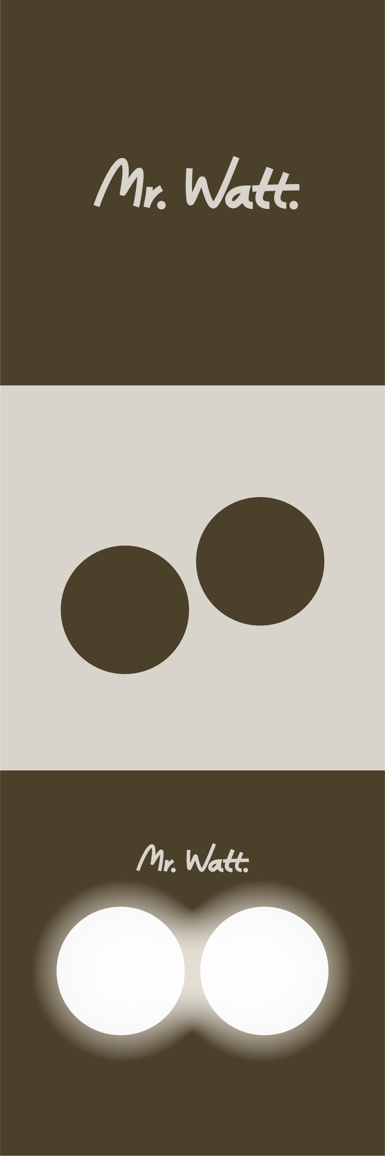
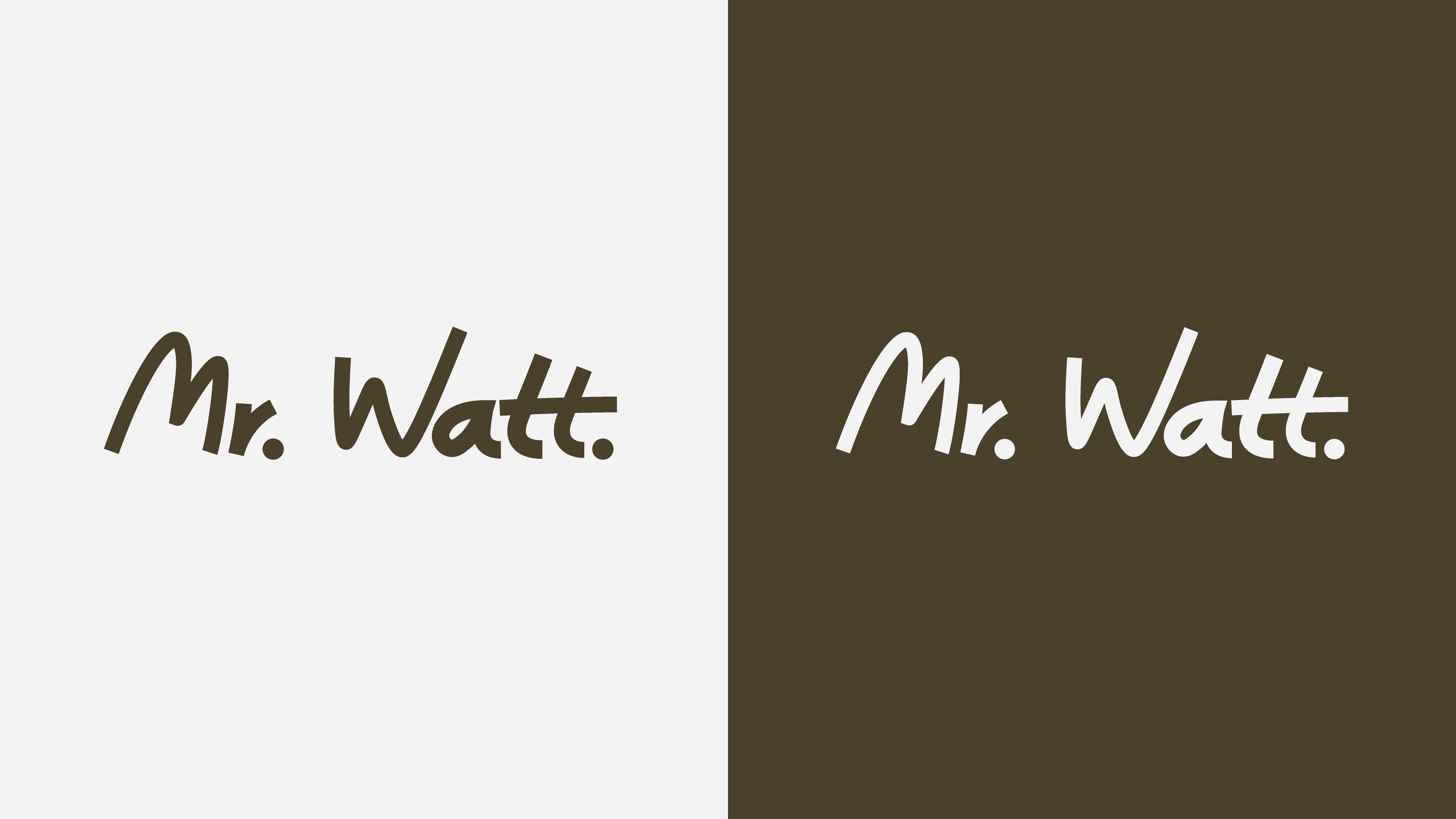
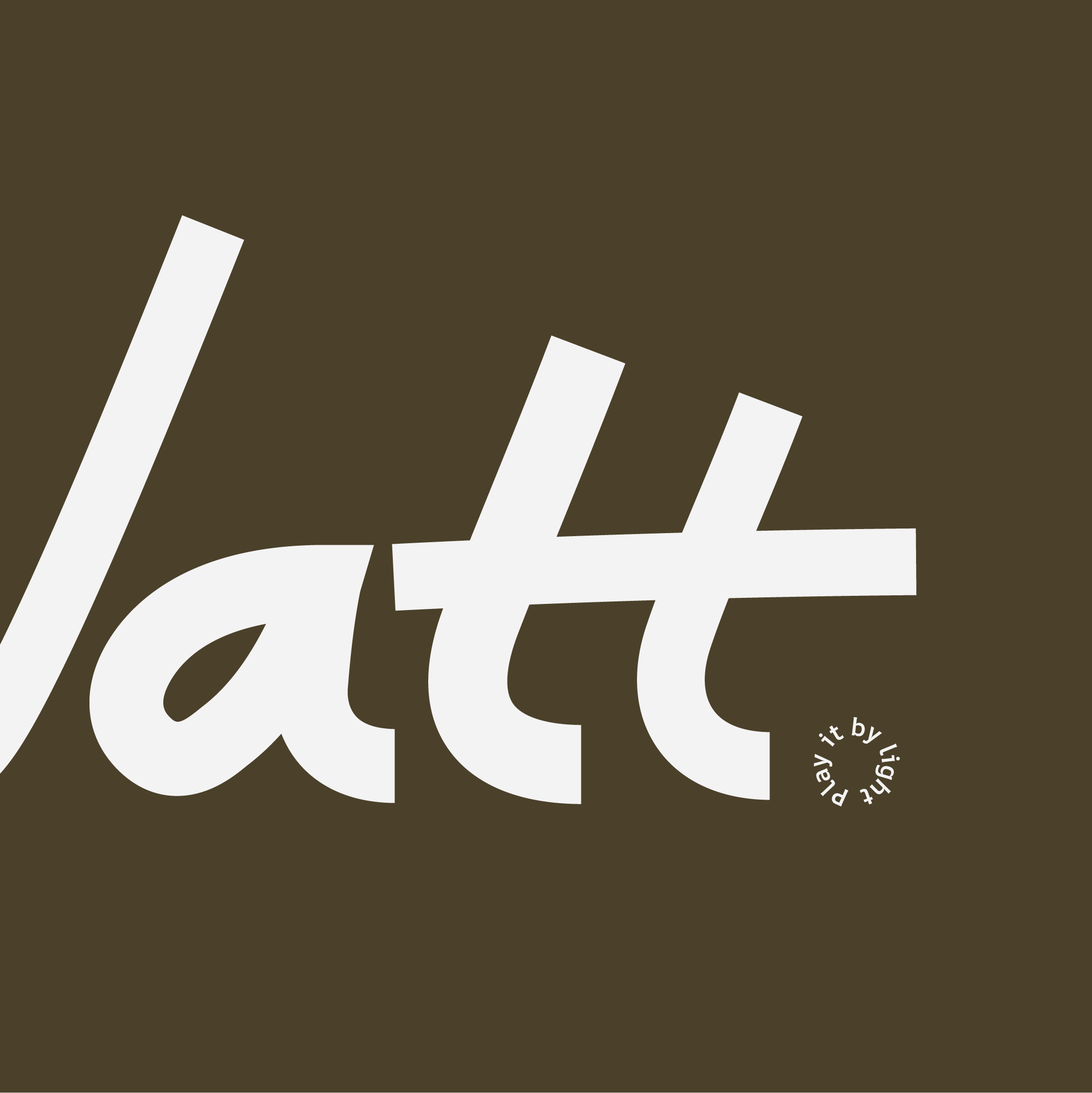
The Mr Watt logo is built for simplicity and recognition.
Its geometric balance mirrors the character of the lamp itself — a blend of friendliness and precision.
Usage
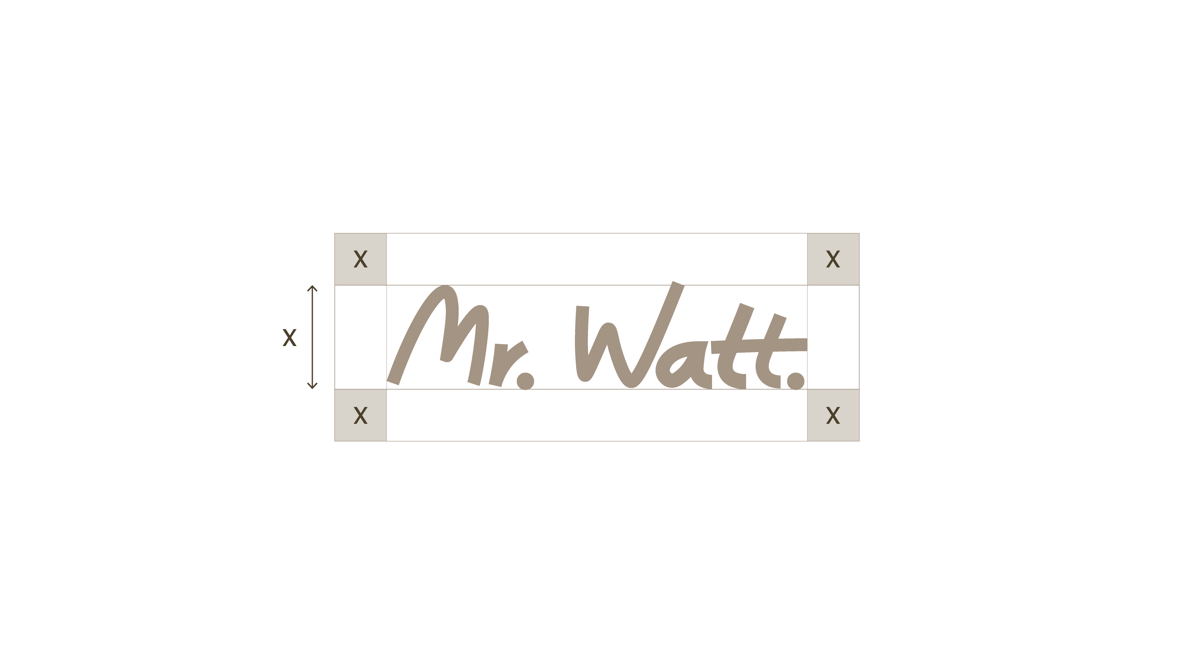
- Keep sufficient clear space around the logo (at least the height of the letter M).
- Use only approved color versions (light, dark, or monochrome).
- Never distort, rotate, or add effects.
Variants
- Primary logo — Mr Watt wordmark.
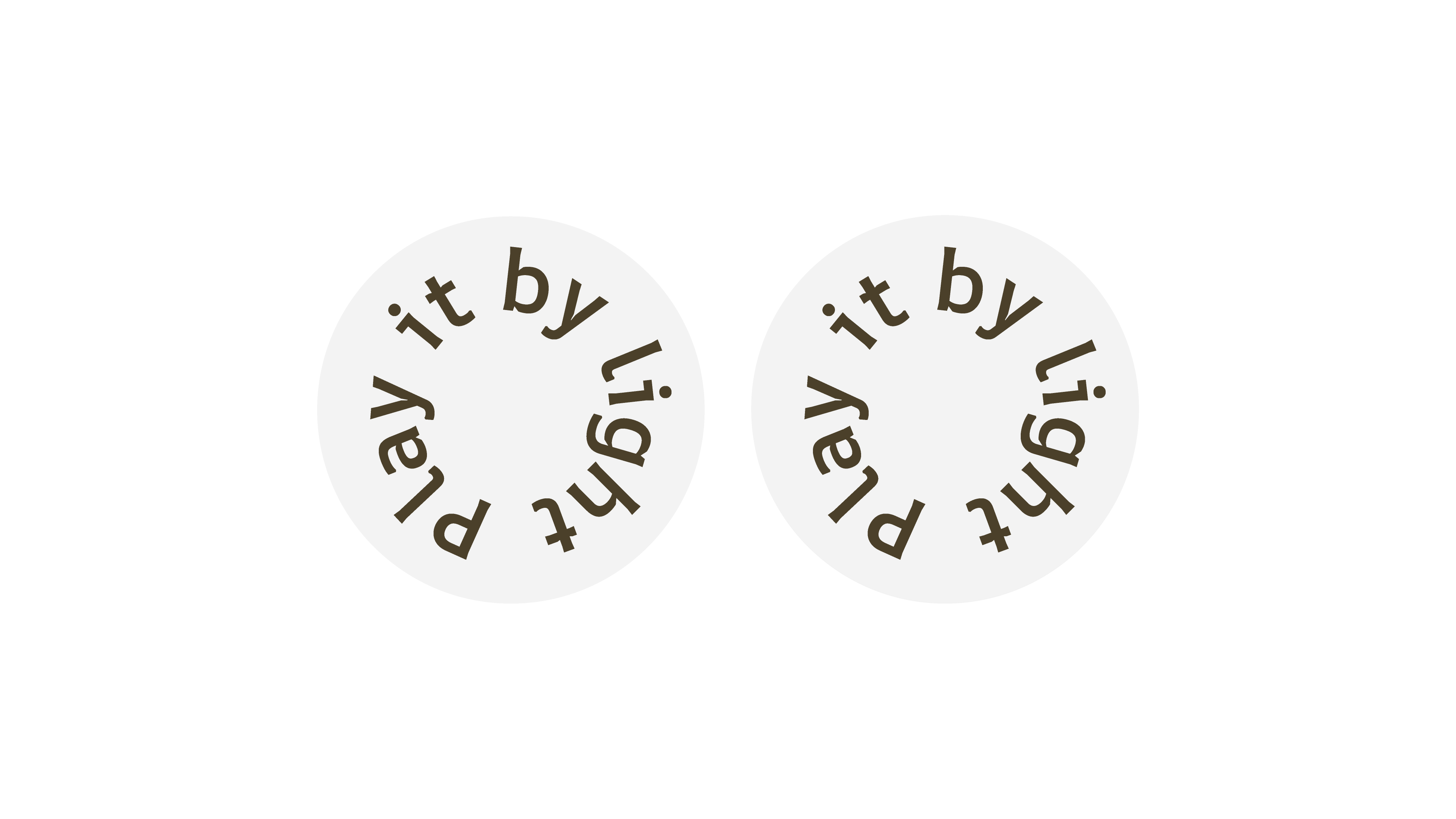
- Lock-up with tagline — “Play it by light.”
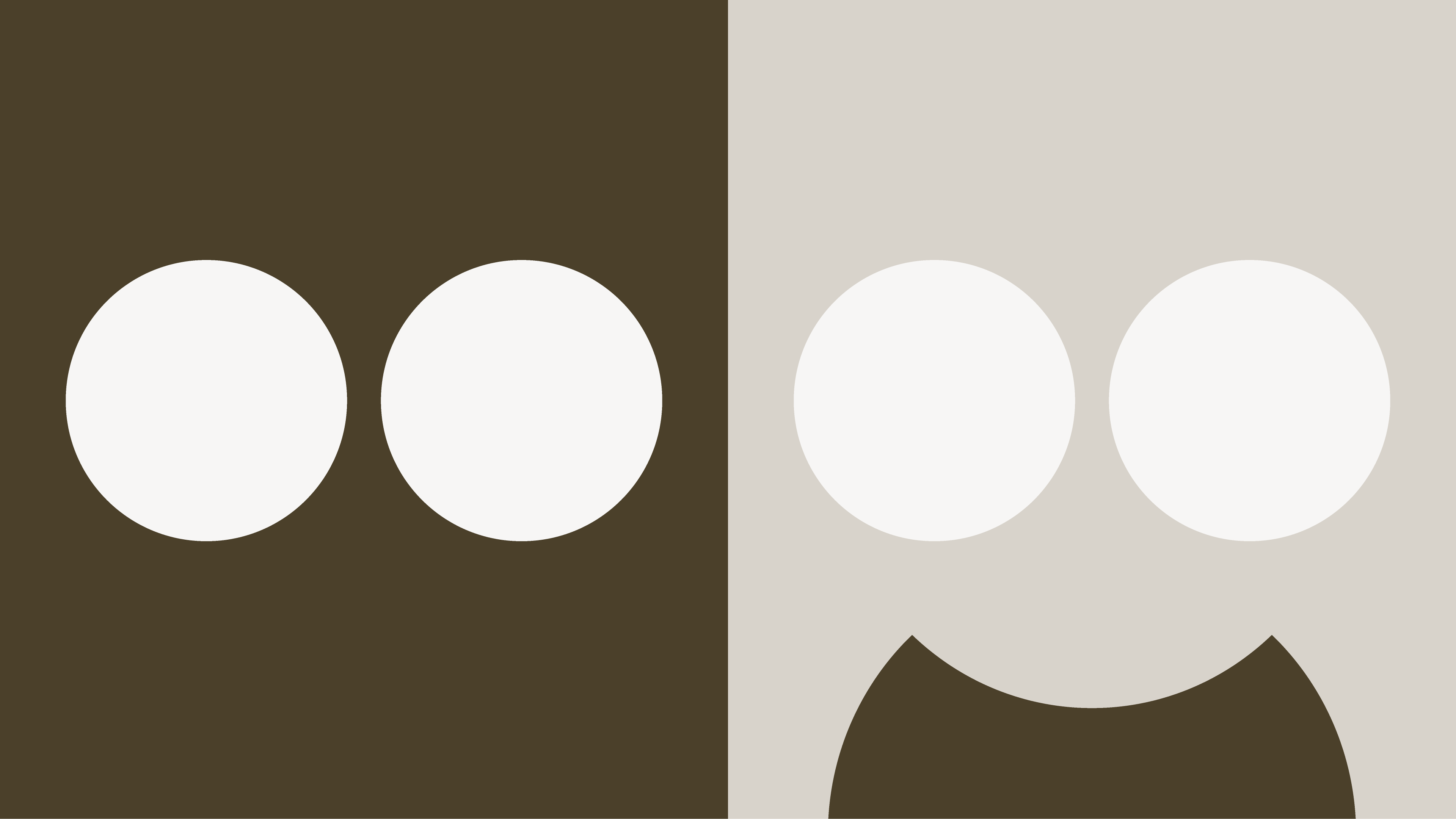
- Icon mark — simplified symbol for small applications (social media, favicon, etc.).
Variants
Clearspace
Pay-off
Primary Logo

06
Color
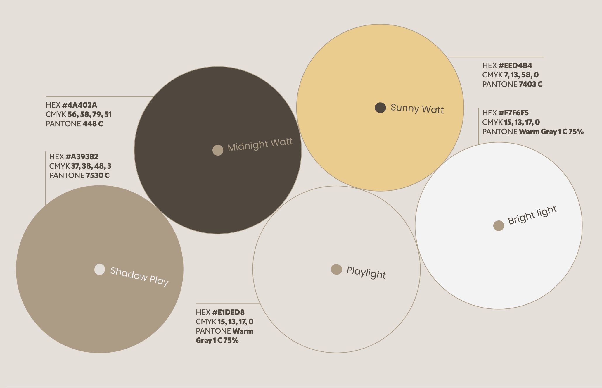
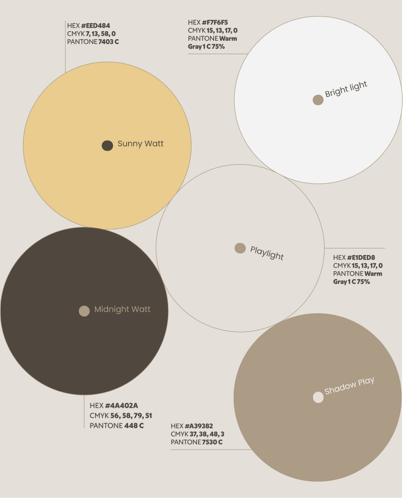
Mr Watt’s color palette is inspired by natural light and warm materials. It balances depth with softness — giving the brand a tone that is modern, calm, and full of character.
Each color has its own role:
Midnight Watt
A deep grounding tone used for structure, contrast, and night-time ambience.
Shadow Play
A neutral dark shade that adds balance and stability across layouts.
Playlight
A warm, soft hue that reflects the gentle glow of evening light.
Bright Light
A clean, fresh tone that keeps digital spaces airy and readable.
Sunny Watt
A lively accent that brings joy, warmth, and subtle playfulness.
Use colors intentionally:
Light for clarity.
Dark for depth.
Warm accents for personality.
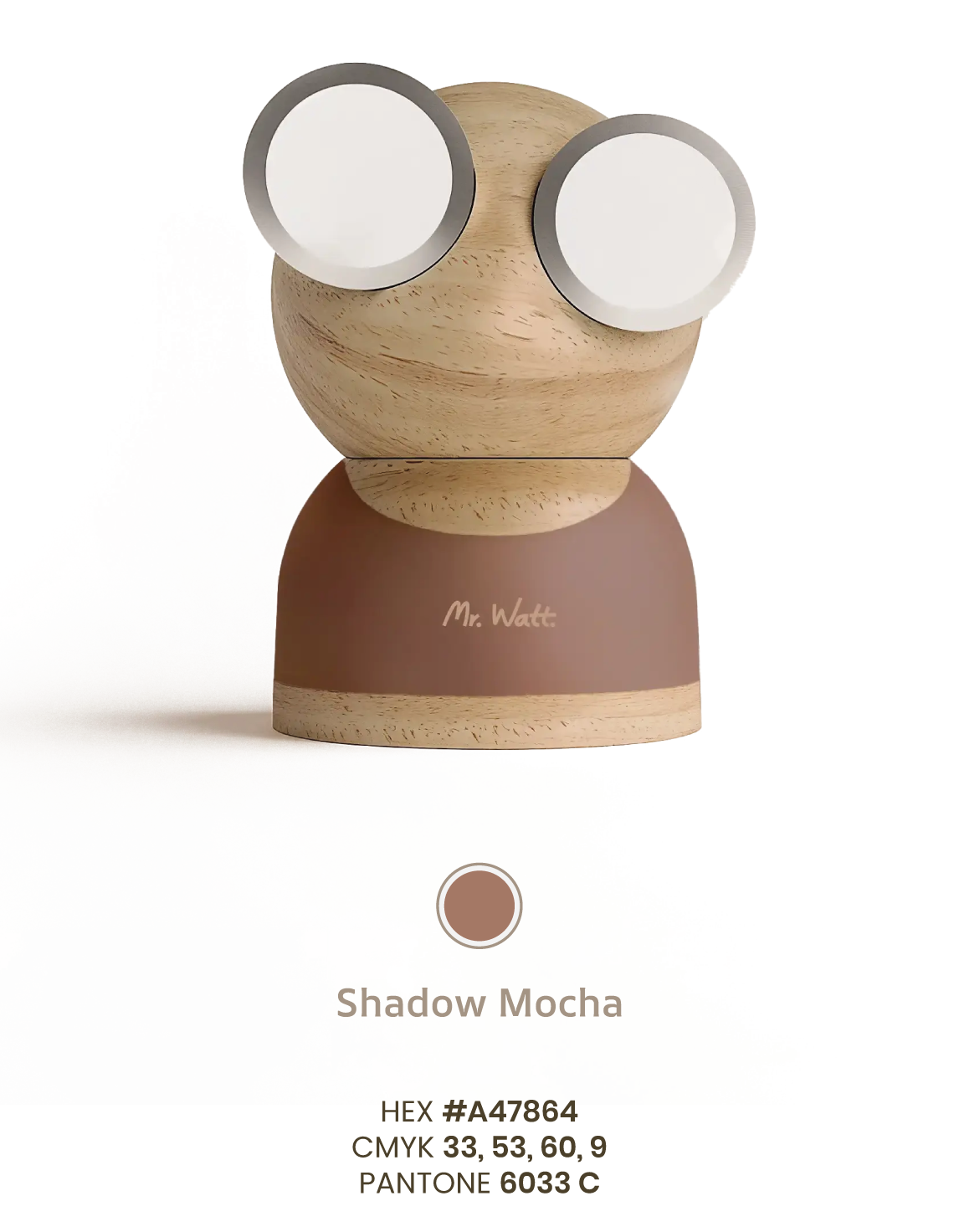
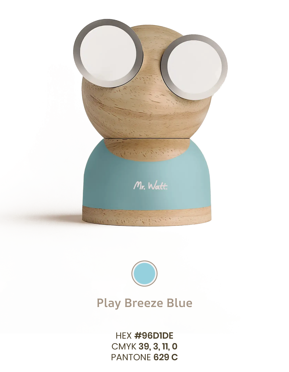
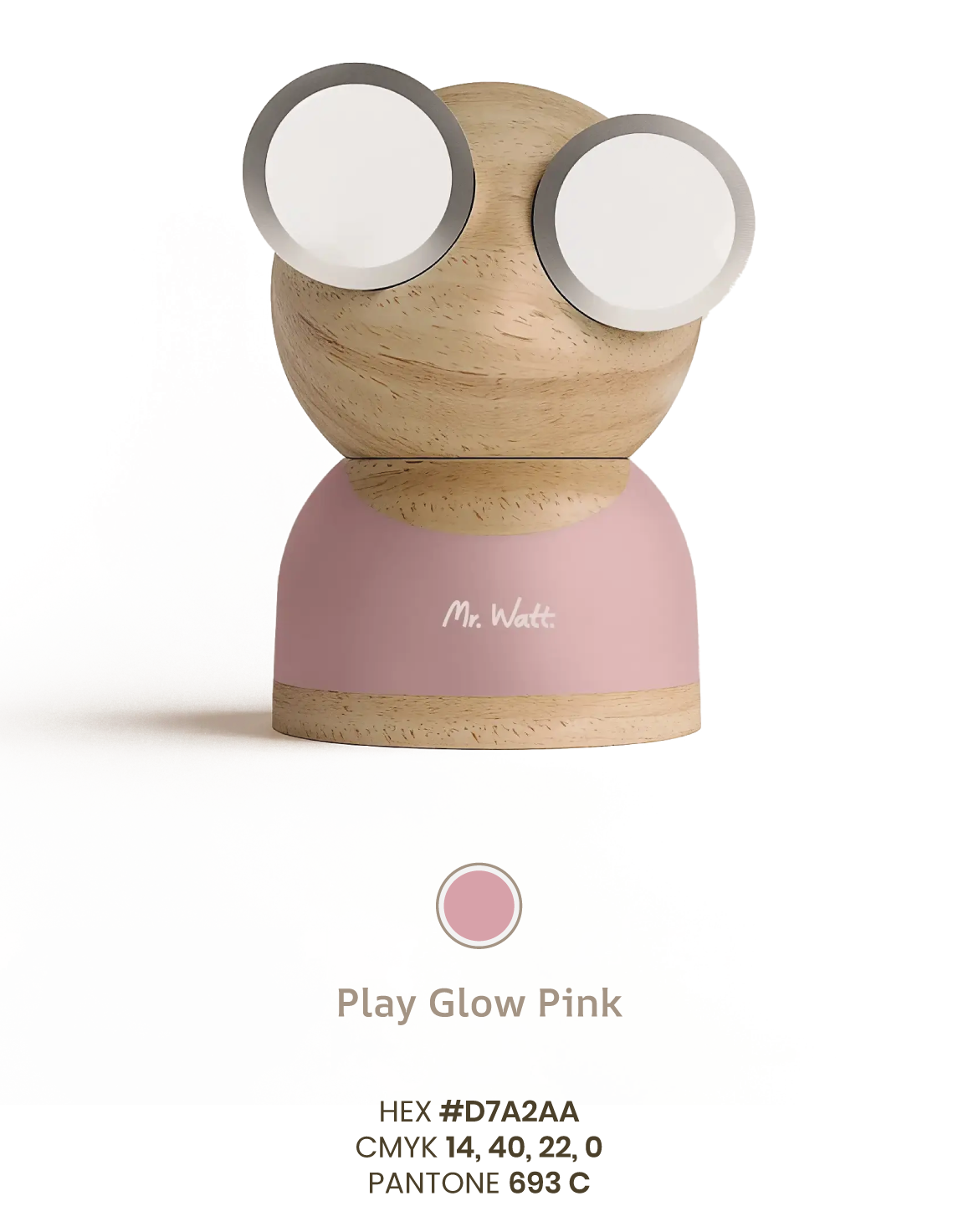
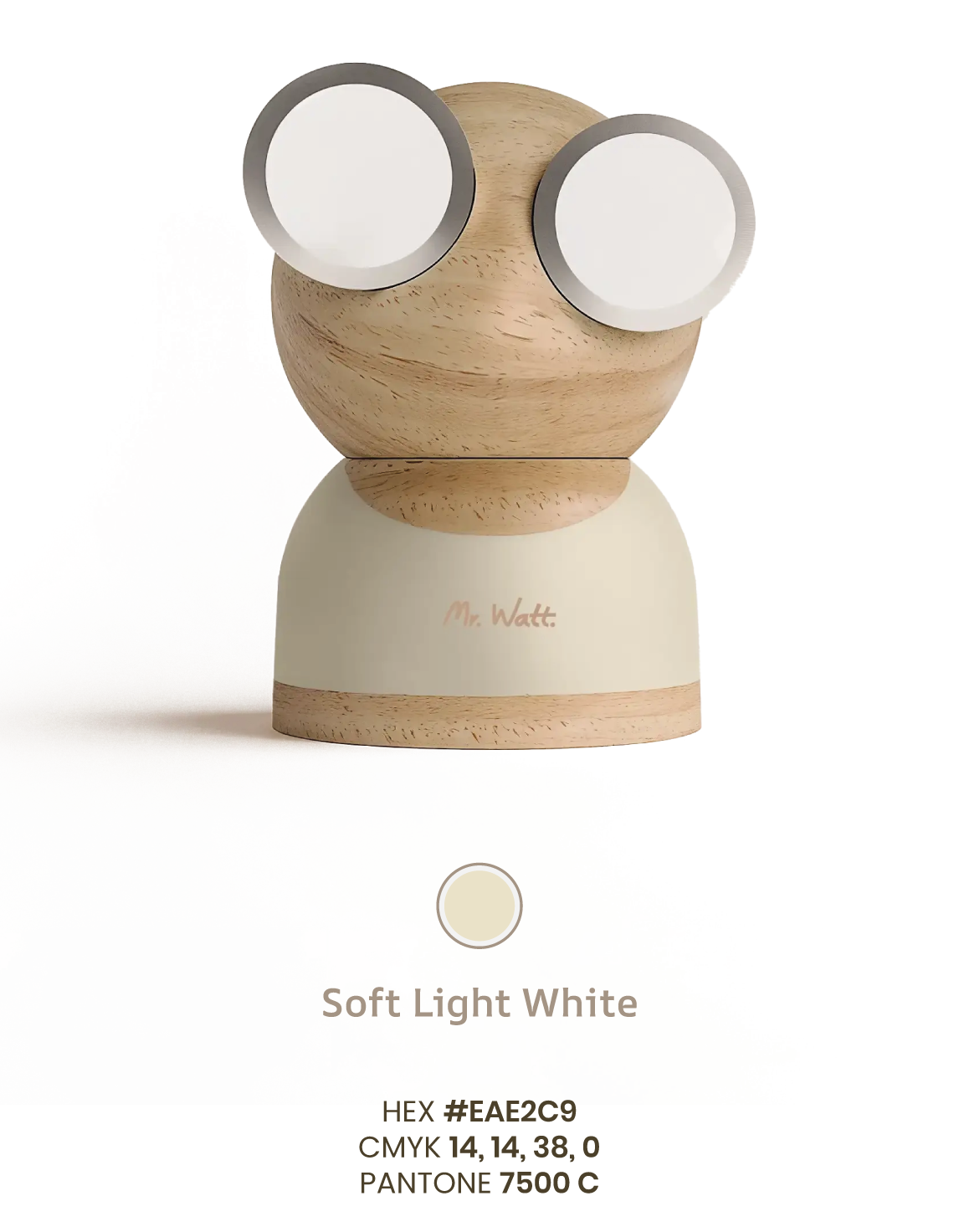
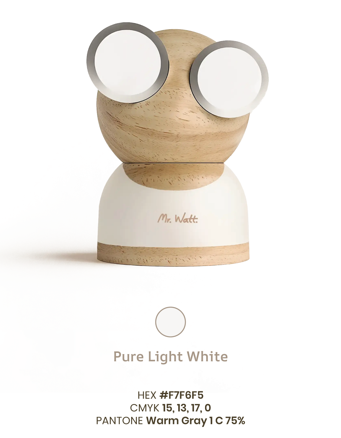
Series 01 colors
The current product lineup, Series 01, is available in five distinct colors designed to blend naturally into contemporary interiors. These shades will evolve over time, ensuring Mr Watt stays aligned with shifting design trends and home atmospheres.
05
Graphic Elements
Redo’s color palette is designed to evoke trust, reliability, and financial clarity, ensuring that every touchpoint reflects our commitment to accuracy and efficiency.
Together, these colors create a strong, dependable, and forward-thinking brand identity, ensuring that Redo is instantly recognized as the go-to solution for financial corrections and optimization.
Examples

07
Typography
Mr Watt’s typographic system reflects the brand’s balance between character and clarity — friendly, modern, and always approachable. The combination of AR One Sans and Poppins creates a visual language that feels expressive yet effortless, giving the brand its warm and playful tone without losing precision.
Primary Typeface — AR One Sans
AR One Sans is our signature typeface.
It carries a subtle sense of personality — rounded, confident, and full of charm. Its distinctive letterforms make it ideal for headlines, short statements, and any moment where the brand needs to show character.
This typeface brings the “Mr Watt feeling” to the forefront: warm, inviting, and just a little playful.
Secondary Typeface — Poppins
Poppins is our workhorse for all longer texts and functional communication.
With its clean geometry and excellent readability, it keeps paragraphs clear and comfortable to read across digital and print environments.
Used for body copy, descriptions, and storytelling, Poppins adds balance to the brand’s visual rhythm — calm, structured, and easy on the eyes.
Together, AR One Sans and Poppins create a typographic voice that feels human and expressive — always clear, always warm, and always in tune with the character of Mr Watt.
Manrope Bold
Manrope Semibold
Manrope Medium
Manrope Regular
ABCDEFGHIJKLMNOPQRSTUVWXYZ
abcdefghijklmnopqrstuvwxyz
ABCDEFGHIJKLMNOPQRSTUVWXYZ
abcdefghijklmnopqrstuvwxyz
ABCDEFGHIJKLMNOPQRSTUVWXYZ
abcdefghijklmnopqrstuvwxyz
ABCDEFGHIJKLMNOPQRSTUVWXYZ
abcdefghijklmnopqrstuvwxyz
Poppins Bold
Poppins Semibold
Poppins Medium
Poppins Regular
ABCDEFGHIJKLMNOPQRSTUVWXYZ
abcdefghijklmnopqrstuvwxyz
ABCDEFGHIJKLMNOPQRSTUVWXYZ
abcdefghijklmnopqrstuvwxyz
ABCDEFGHIJKLMNOPQRSTUVWXYZ
abcdefghijklmnopqrstuvwxyz
ABCDEFGHIJKLMNOPQRSTUVWXYZ
abcdefghijklmnopqrstuvwxyz
ABCDEFGHIJKLMNOPQRSTUVWXYZ
abcdefghijklmnopqrstuvwxyz
08
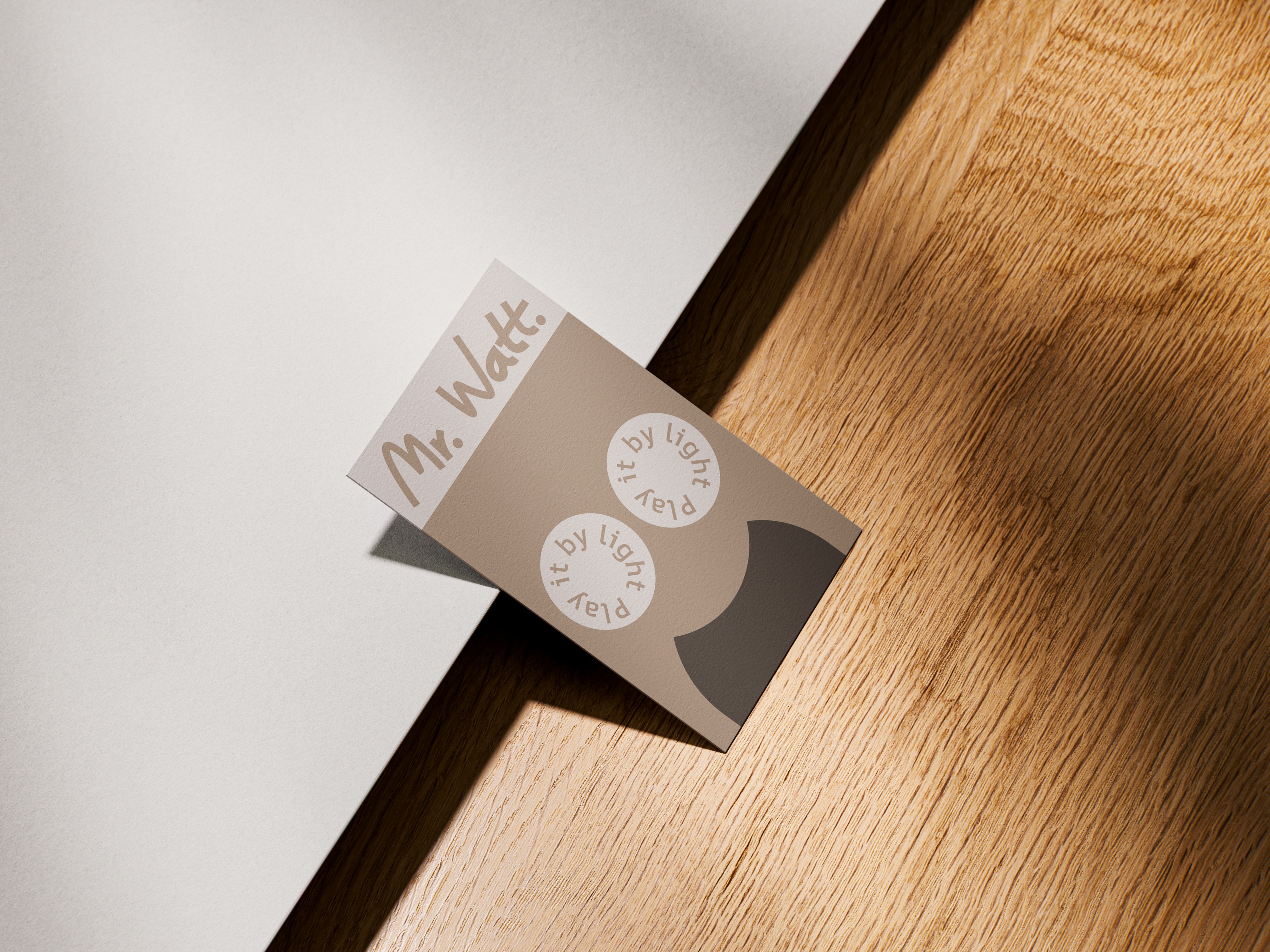
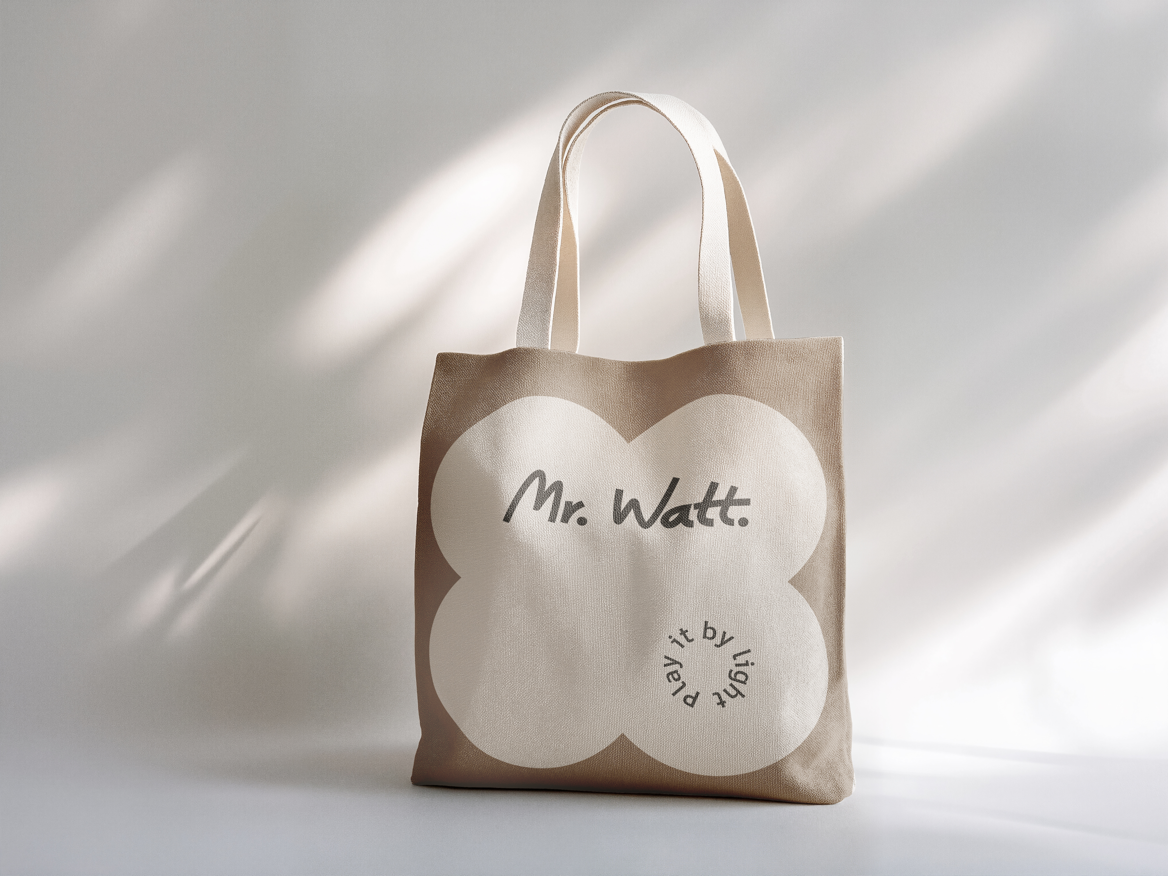
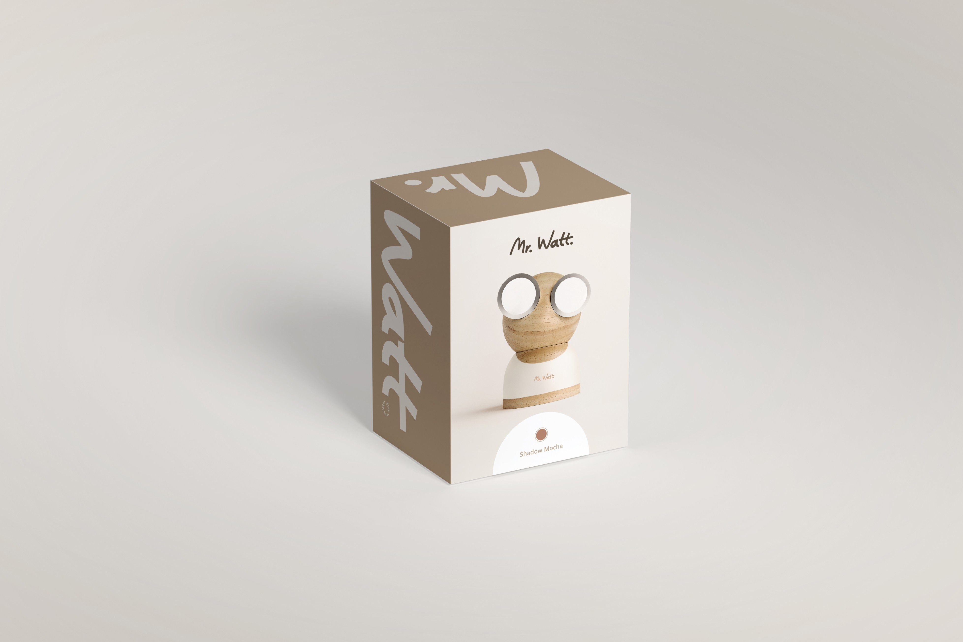
Brand in use
